Luna Creamery
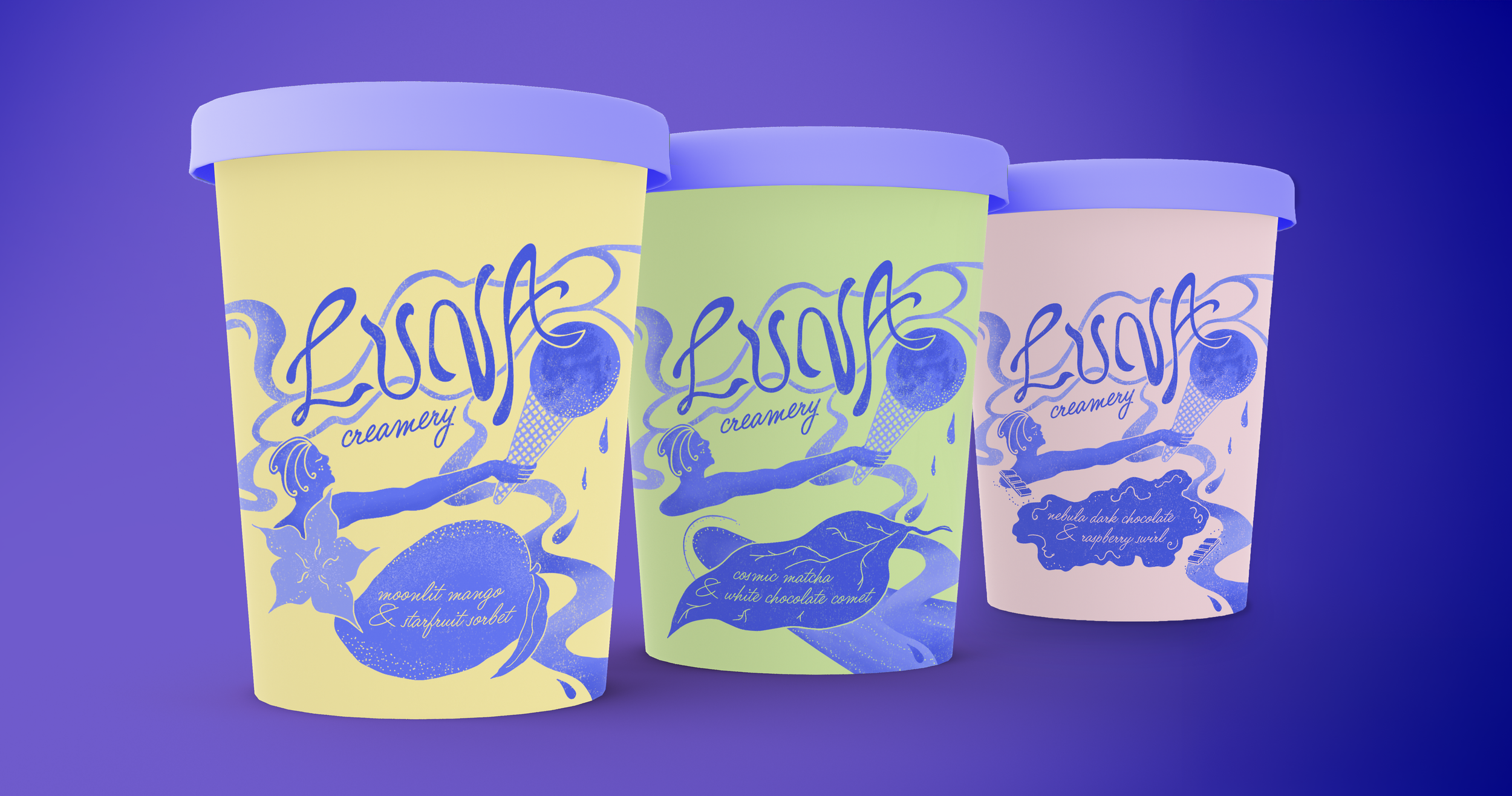
Packaging design for three different flavours of ice cream.
Packaging design for a fictional gourmet ice cream brand called Luna Creamery. This is a self-initiated project, following a brief set by Inky Goodness Collective for the Make Your Mark Illustration Bootcamp course that I have been taking this year.
The brief was to make a brand identity and illustrated packaging for Luna Creamery, which is a brand that blends high-quality ingredients with artistic, dreamlike aesthetics. The brand's identity is whimsical, celestial and luxurious, targeting an audience that values both premium flavours and handcrafted design.
For this brief, I made "Luna" (meaning "moon" in Latin) a female character holding the moon as an ice cream scoop in a cone. I took inspiration from Art Nouveau and monochromatic aesthetics. Each flavor is differentiated by one pastel color, while coherency is created throughout the ice cream flavors with the consistent blue/lavender colors.
The "Luna" logo is a hand-lettered design created using Adobe Illustrator.


